Regenerative Medicine Logo Design Project
A new medical treatment company needed brand elements for their business.
A new medical treatment company needed brand elements for their business.
Regenerative Medicine USA is a company headquartered in Rexburg, Idaho that specializes in revolutionary new medical treatment methods. When they reached out to the Vulpine logo development team, they didn't have any brand assets whatsoever.
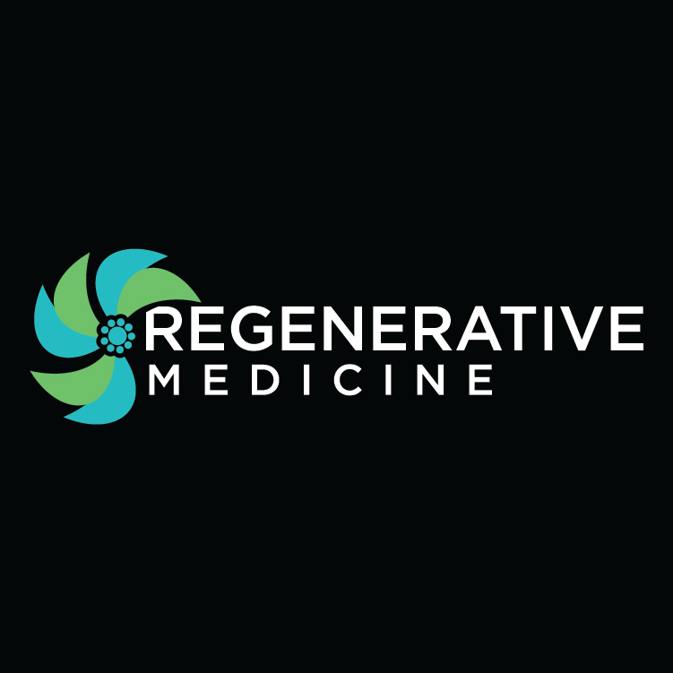
Things we wanted to help Regenerative Medicine communicate in their logo: medical in nature, modern and new science, regenerative and alternative medical approach.
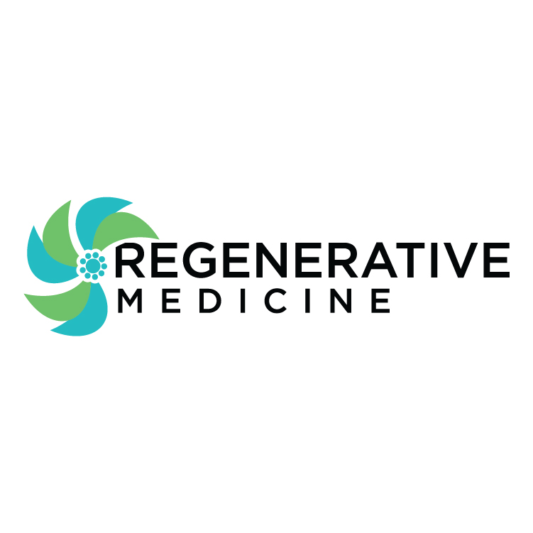
These are the designs that were chosen at the end of the process. Vulpine Marketing's logo design Process is quite different than other marketing agencies.
Every design project requires a series of choices to create the end product. We had to choose things like which font to use, what color to use, how and if to use some kind of a shape for the business.
During this phase of the logo design process we learn about the business and industry. We use the information gathered during this phase to shape the rest of the process. We take a look into what has been done for similar companies if there are any. Sometimes during this process we can find very strong and successful design examples. Sometimes we can also find terrible examples and learn what to avoid!
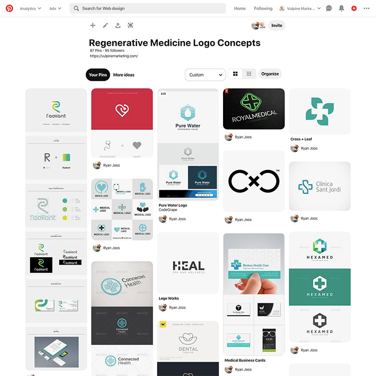
During this phase, we compiled nearly a hundred design examples using a Pinterest board to consolidate the designs. From this we realized the prevalence of the color blue and even green in the medical industry. It's interesting how common these colors are. Many people will associate the red cross as the typical symbol for hospitals and medical facilities. As an industry there has been a move towards cooler, less alarming colors to separate from the emergency or alarming mental association some may have with the bright red cross.
We still wanted people to quickly identify the company as something medical-related. Which naturally led us to exploring the medical cross shape but using blue/green colors. Regenerative medicine is a newer realm of science so we also wanted to incorporate elements of that nature as well. We looked at helix designs and other aspects.
Every design project requires a series of choices to create the end product. We had to choose things like which font to use, what color to use, how and if to use some kind of a shape for the business.
Below are examples of other logo concepts we explored.


Ready to get started? Let's talk!
We value true partnerships. If you do as well, then let's talk. Vulpine is ready to be your company's Chief Marketing Officer without you having to provide health insurance.